
UX · Website overhaul
Hudsons Canada’s Pub
A simpler customer experience and a more flexible foundation for a multi-location pub.
The overhaul simplified menu discovery and reservations, improved mobile usability, and enabled internal teams to manage content and location-specific workflows without ongoing developer support.
- Client
- Hudsons Canada’s Pub
- Project
- UX and website overhaul
- Focus
- Customer experience and internal workflows
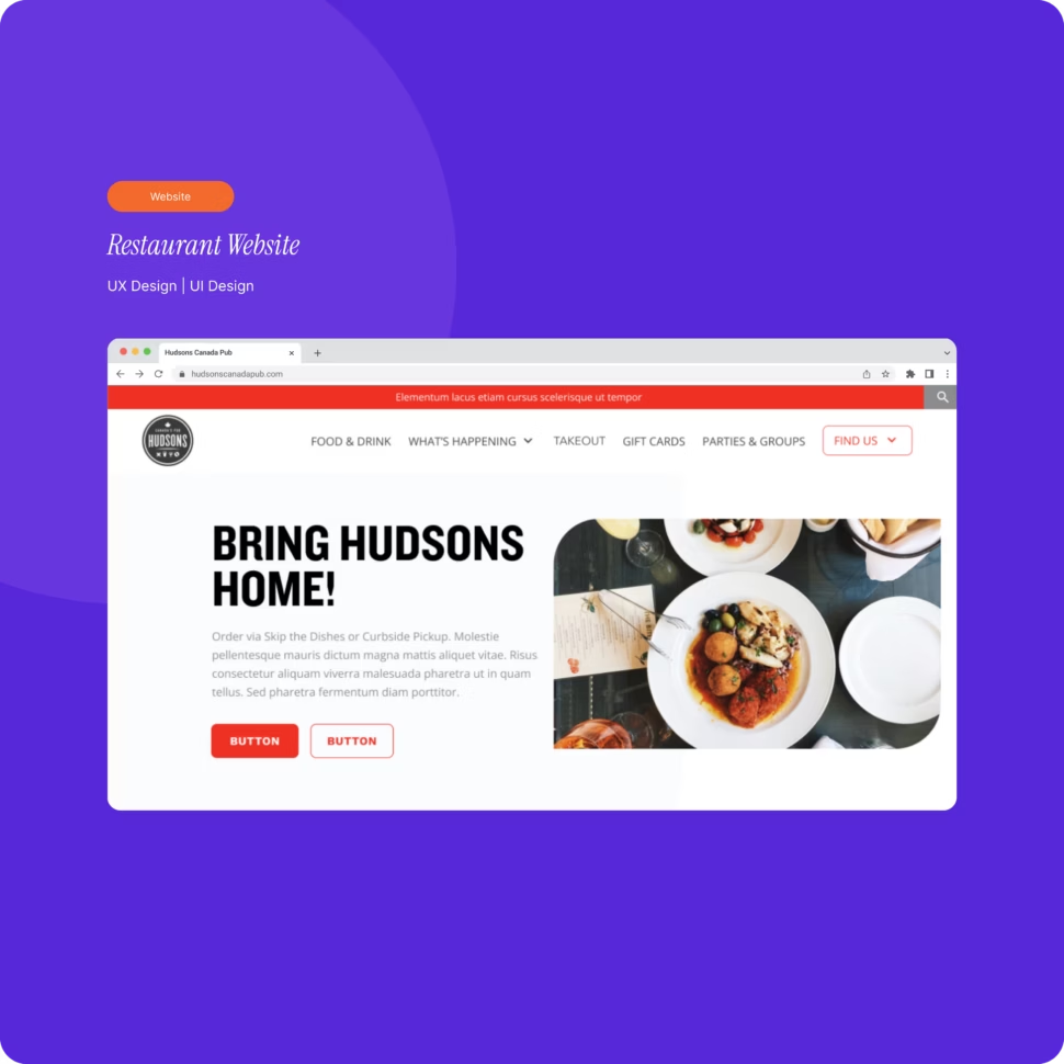
Project introduction
Project overview
The project was a UX and website overhaul for Hudsons Canada’s Pub, focused on improving the customer experience while reducing operational friction across multiple locations.
The redesigned experience needed to work for customers browsing menus or making reservations and for internal teams managing content and location-specific workflows.
The problem
The existing website created friction for customers and internal teams.
Customers struggled to browse menus and make reservations, particularly on mobile. Staff also depended on developers for routine content updates.
Reservations from every location were routed into a single backend flow, making it difficult for teams to manage requests efficiently.
Project goals
What the work needed to accomplish.
- 01Simplify menu browsing and reservation flows
- 02Improve mobile navigation and readability
- 03Enable internal teams to manage content independently
- 04Clarify location-specific reservation workflows
- 05Create a scalable structure that supports growth across locations
The approach
A considered path from context to execution.
Re-structured information architecture
The site’s information architecture was audited and reorganized to improve discoverability across key customer and staff journeys. Navigation and page hierarchy were simplified so menus, locations, and booking actions could be found without unnecessary steps.
Customer-focused experience
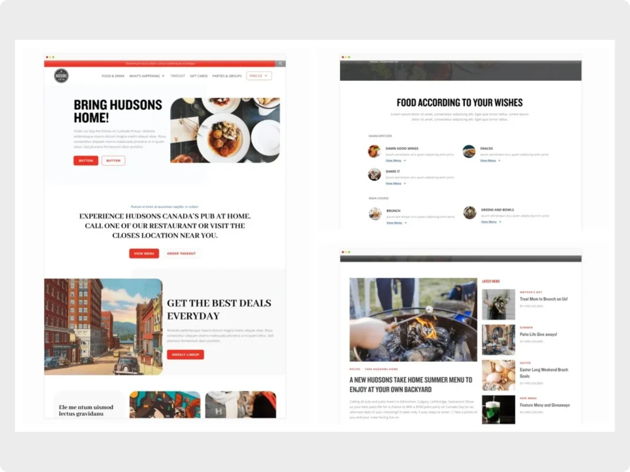
Menu presentation was simplified for faster scanning, reservation and contact flows were streamlined, and mobile-first layouts supported in-venue and on-the-go use.
Team empowerment and CMS flexibility
Modular, component-based page blocks enabled marketing and location staff to update menus, promotions, and content without developer involvement while clarifying location-specific reservations and inquiries.
The solution
A scalable design foundation for customer and staff journeys.
Consistent interface patterns and layout rules created a flexible system for promotions, menus, and individual location pages.
- Simplified menu presentation
- Streamlined reservation and contact flows
- Mobile-first layouts
- Modular page blocks
- Location-specific reservation clarity
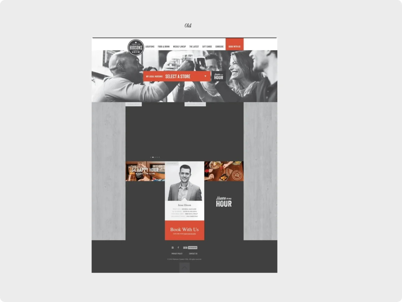
The previous website — A reference view of the existing Hudsons website before the information architecture and interface were reorganized.
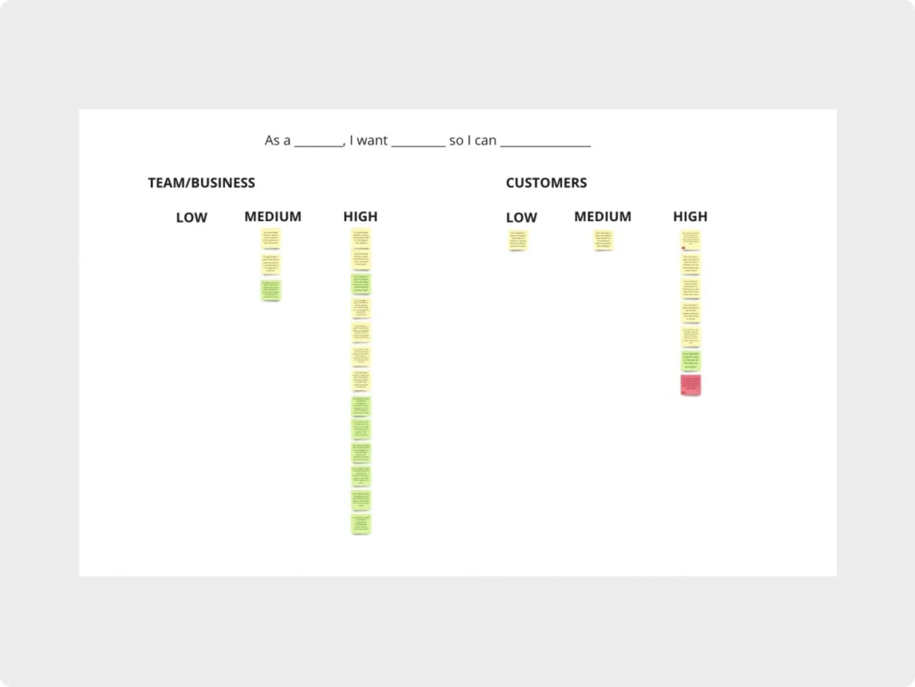
Prioritizing customer and business needs — Customer and team needs were organized by priority to inform the website structure.
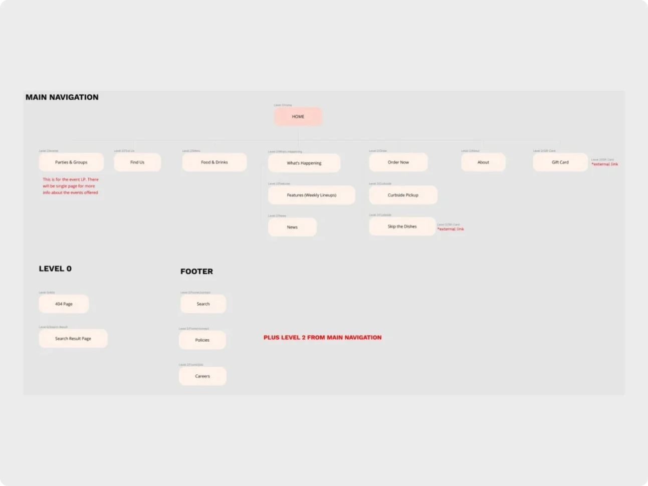
From structure to interface — The reorganized navigation and redesigned page explorations show how the solution moved from information architecture into interface design.
The outcome
A more usable experience and a foundation built to scale.
The result improved usability for mobile-first customers and reduced reliance on developers for ongoing content updates.
- Clearer, more manageable reservation handling across locations
- A scalable foundation for future growth and new locations
Services provided
Related work
More from the studio.
Start a project
Have something similar in mind?
Tell us what you are building, what needs improvement, or where your team needs experienced support.