INPHONITE
Navigation Restructure
A clearer, more predictable way to navigate the Inphonite platform.
This focused project improved navigation and information architecture within Inphonite by regrouping related features, clarifying labels and interaction states, and aligning the experience with a new Kendo Telerik–based design system.
- Client
- Inphonite
- Project
- Navigation Restructure
- Focus
- Navigation and information architecture
Project introduction
Project overview
A focused navigation restructure within the Inphonite platform.
The project updated Inphonite’s legacy navigation system to improve usability, clarity, and consistency while aligning navigation patterns with a new Kendo Telerik–based design system.
The scope was deliberately focused on improving navigation and information architecture within the existing platform. Given the available budget and scope, it was not a redesign of the entire Inphonite platform or a full information architecture overhaul.
The problem
A cluttered, inconsistent navigation system made everyday tools difficult to locate.
Related features were spread across multiple menus, labels lacked clarity, and visual states provided little hierarchy. As the navigation had grown over time, these inconsistencies created friction during everyday use.
Project goals
What the work needed to accomplish.
- 01Simplify navigation through clearer grouping and labeling
- 02Reduce friction when locating frequently used tools
- 03Improve visual hierarchy and interaction states
- 04Align navigation patterns with the Kendo Telerik design system
The approach
A considered path from context to execution.
Regroup the navigation
The structure was reorganized using input from the support team and common user pain points. Related features were grouped to reduce duplication, surface commonly used tools more clearly, and make navigation more predictable.
Align the interface system
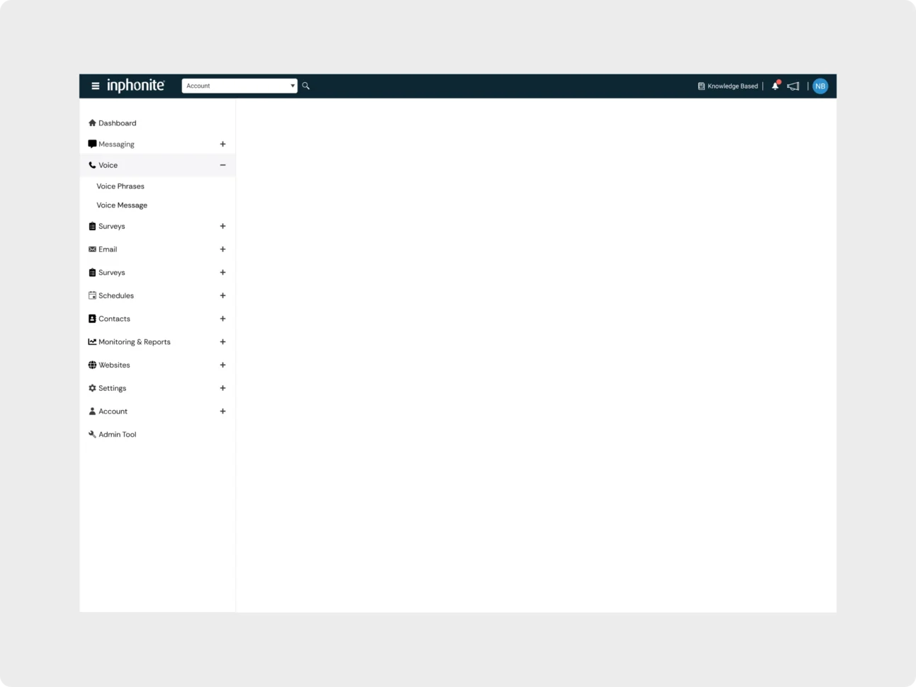
Spacing and alignment were refined for scannability, consistent hover, active, and selected states were introduced, and the sidebar was implemented with standardized Kendo Telerik components.
Improve utility and visibility
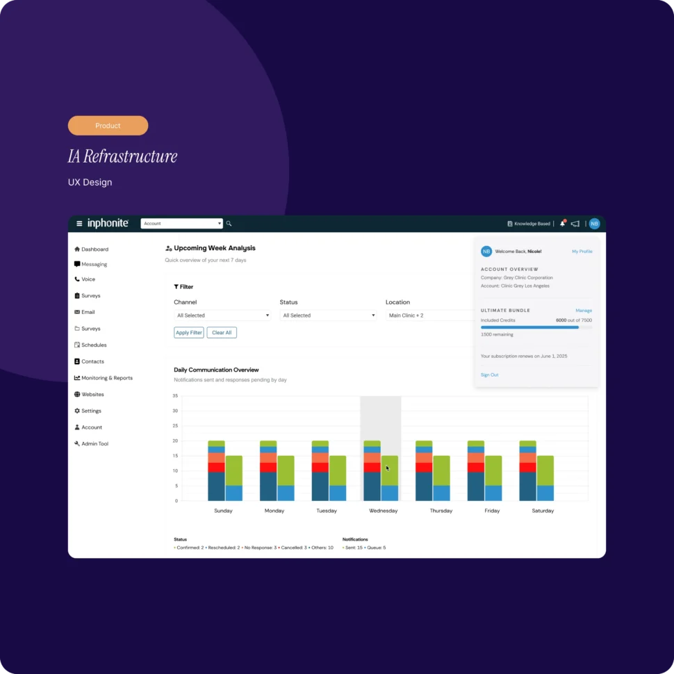
The top navigation was enhanced to provide quicker access to account and settings, while visible credit usage indicators brought frequently needed account information into daily workflows.
The solution
A simpler structure with clearer hierarchy and more visible account utilities.
The solution replaced the legacy grid of tools with a cleaner, persistent sidebar that organizes features into recognizable groups and supports expandable states for related items.
The updated top navigation and account view make settings and credit usage easier to access, while standardized components and interaction states keep the experience consistent with the design system.
- Clearer feature grouping and labeling
- Reduced duplication across navigation areas
- Consistent hover, active, and selected states
- Standardized Kendo Telerik sidebar components
- More visible account and credit usage information
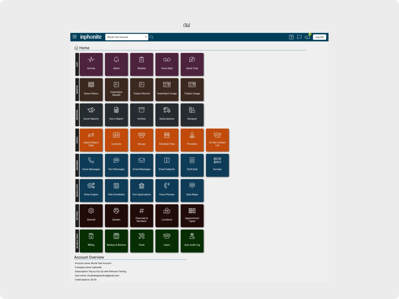
The legacy navigation — The previous home screen distributed tools across a large category-based tile grid, showing the density and fragmentation the restructure needed to address.
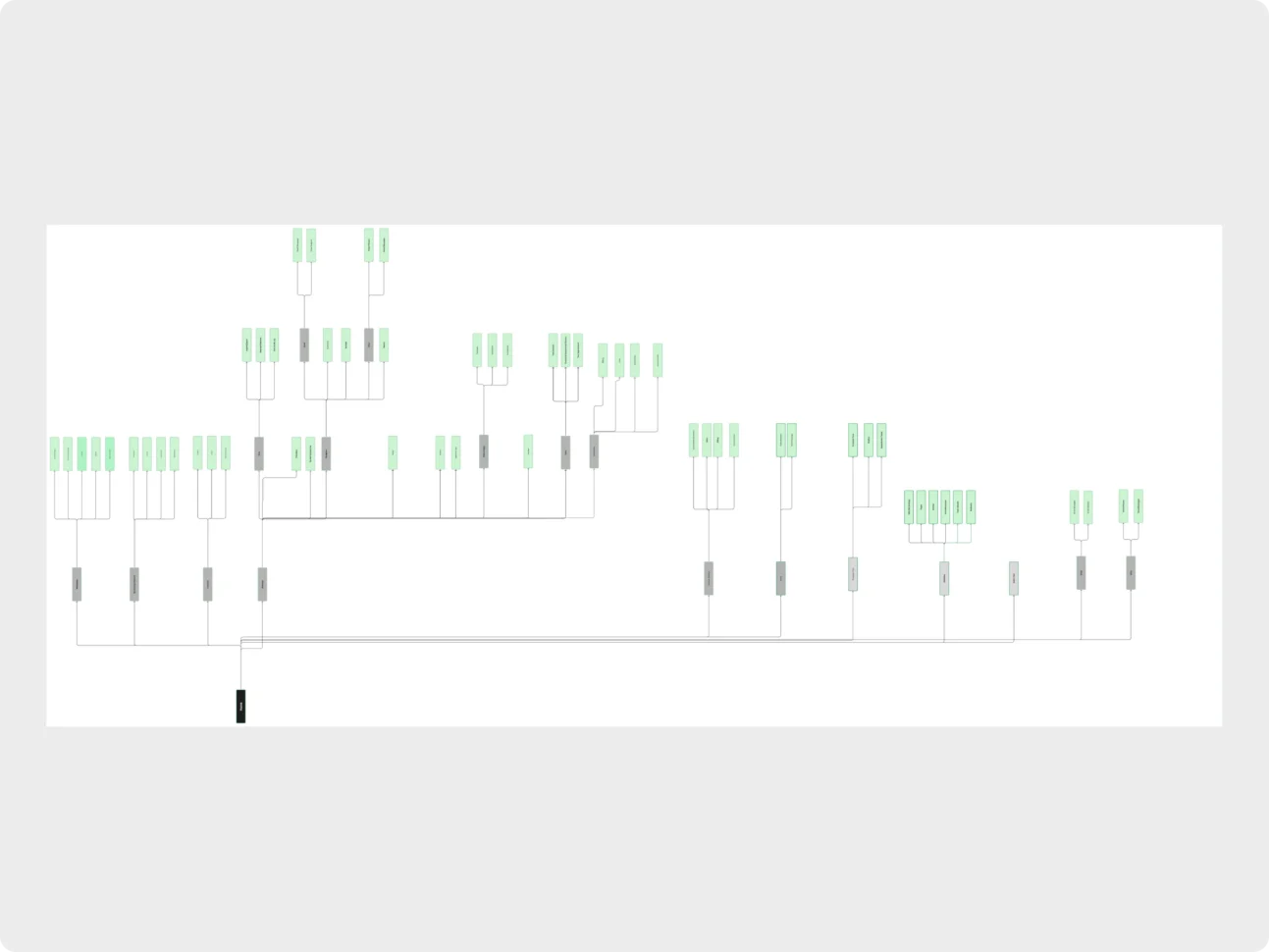
Reworking the information architecture — The supplied information architecture maps feature relationships and navigation groups before they are expressed in the updated interface.
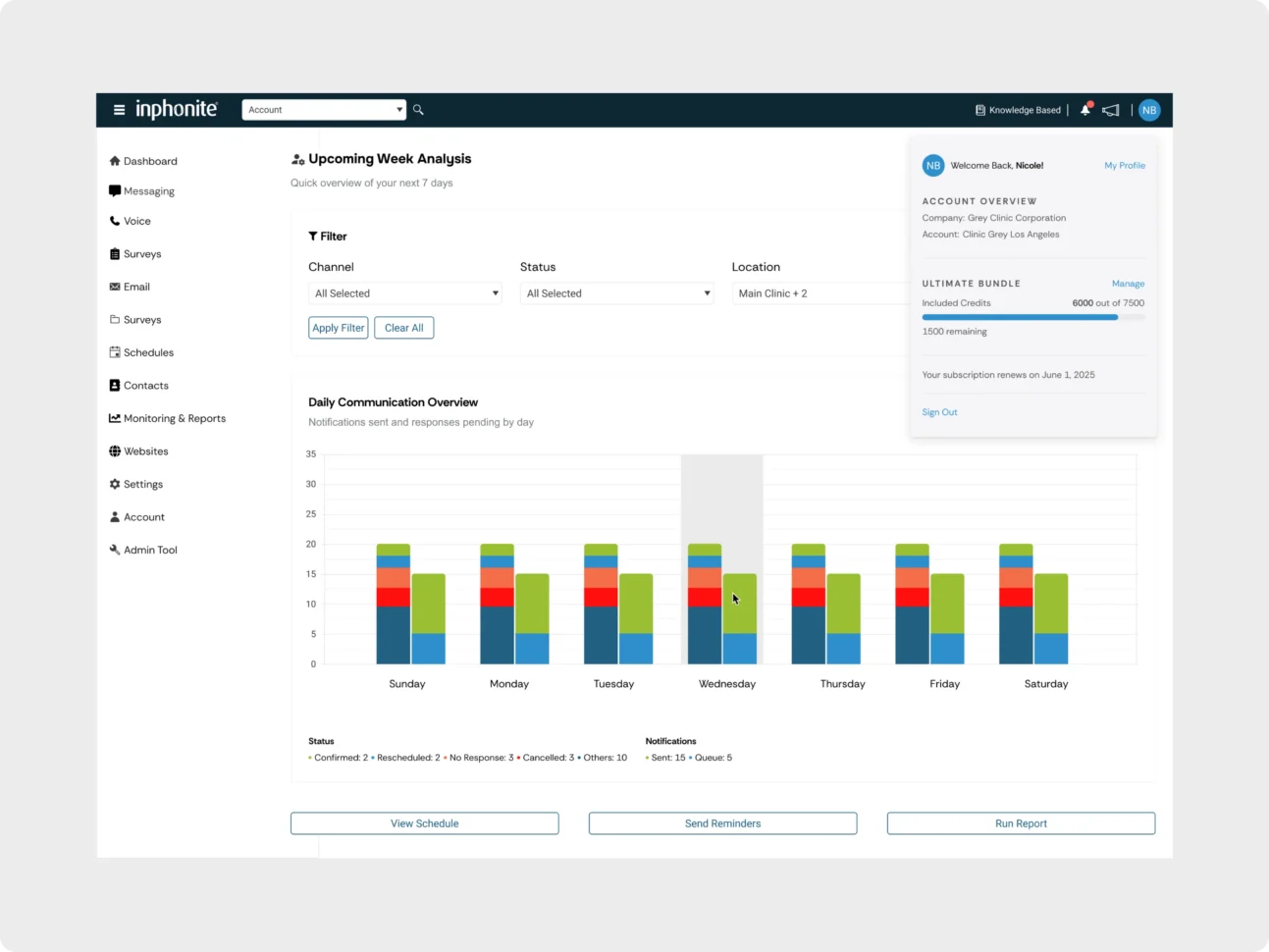
The updated navigation system — The dashboard and expanded sidebar show the persistent navigation, clearer grouping, account access, and visible credit usage in context.
The outcome
A clearer, scalable navigation system for everyday Inphonite workflows.
The completed restructure made frequently used tools and reports faster to access while reducing navigation friction and bringing the interface into alignment with the design system.
- Faster access to frequently used tools and reports
- Reduced navigation friction during everyday workflows
- Consistent, scalable navigation aligned with the design system
- Improved visibility into account and credit usage
Services provided
Related work
More from the studio.
Start a project
Have something similar in mind?
Tell us what you are building, what needs improvement, or where your team needs experienced support.